5 Minimal Holiday Card Ideas
Five minimal Holiday Photo Card Design Ideas to get your creative wheels turning.
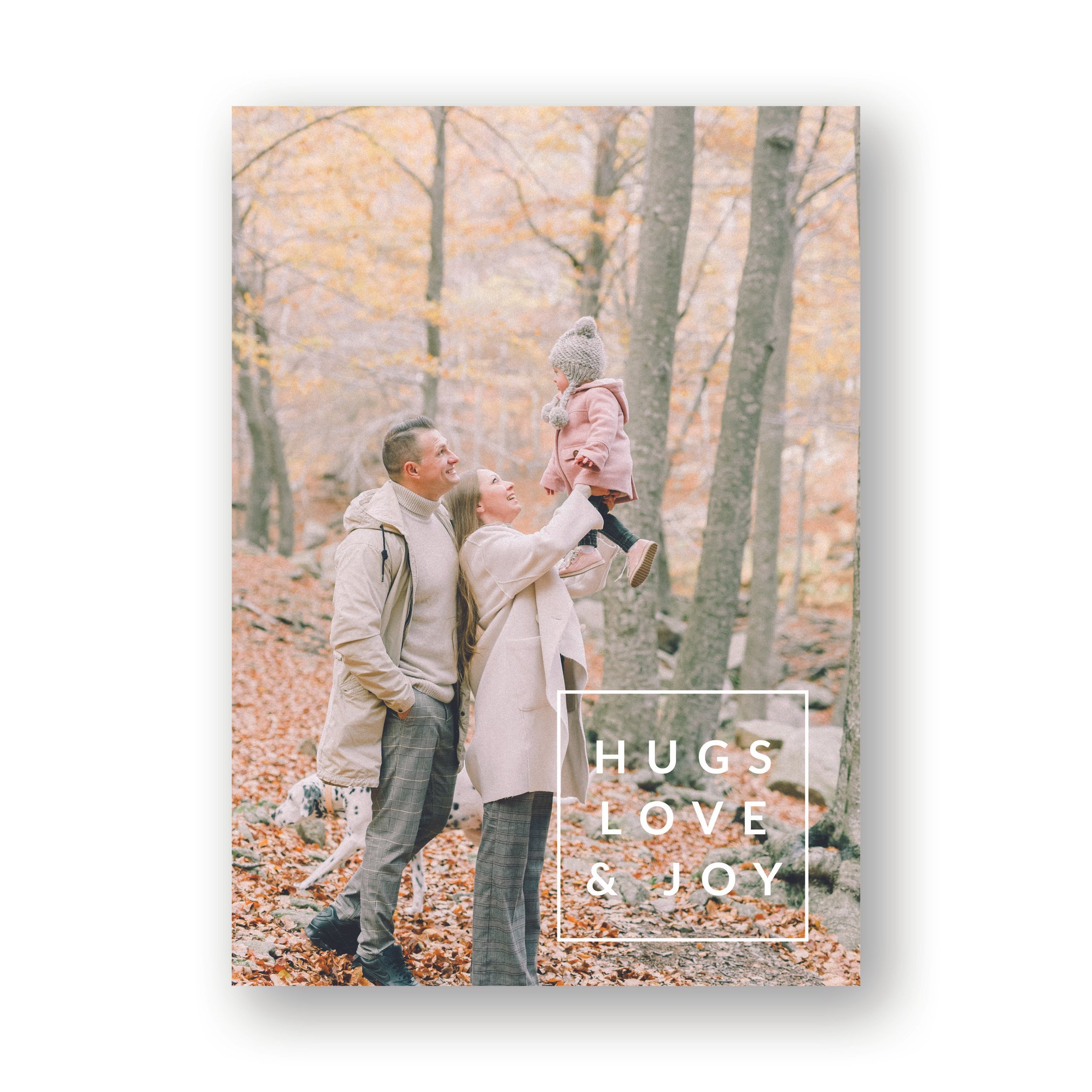
This Hugs, Love, and Joy design is clean and minimal. However, the design relies on the strength of your photo to make the card work. If you want to switch up the words on a design like this, it’s totally fine! Just switch them out though, rather than adding more words. For example, you could have Peace, Love, and Joy rather than Hugs, Love and Joy. You wouldn’t want to just add Peace to the top of Hugs, Love, and Joy though, because the design would begin to feel cluttered.
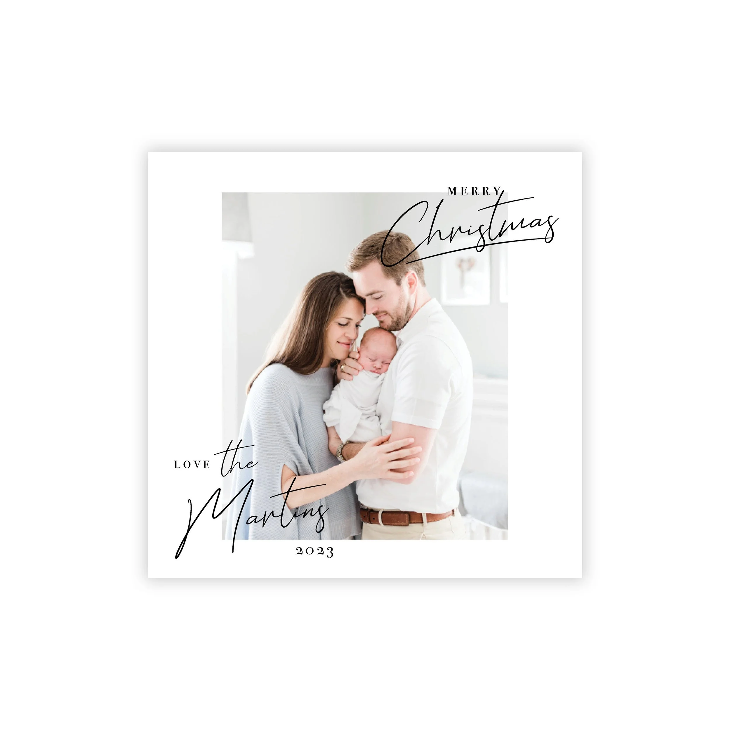
Another great way to have a minimal feel is to go with a clean square design like this one. The White border on this design also adds a timeless feel.
Here is another example of the white border. A beautiful add-on graphic in a corner can make a simple design like this one look good. However, there is something about the confidence of adding nothing, and just allowing the photo to stand on its own with the white border that make the minimal feel elegant.
Prefer a vertical version? All the same principles apply.
Minimal Designs do not need to be “stoic”. This round photo design has a trendy feel, while maintaining a minimal look. This design relies less on the photo and more on the text to do the work of the design. This probably isn’t a great design if you have more than three or four people in your photo.
In summary
Less is more; almost always, especially when you are wanting a minimal feel.
Photos are king. No matter how great your graphic is, all of these designs depend on at least a good photo, and a great one is better.
Minimal is subjective. Don’t get caught up in needing to be 100% “minimalist”; find a design that you love and go with it.
Your physical product matters. Quality paper and print are your final step to ensuring an excellent product. Here is you best place to find that! ;)


